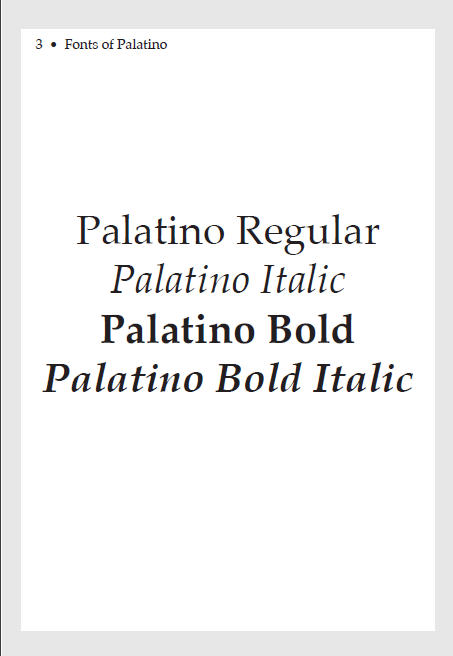
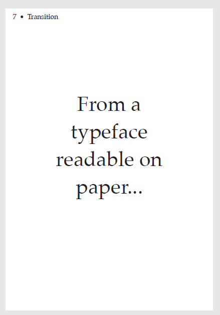
For a class project, I had to choose two typefaces from the 1940s, and those typefaces were Palatino and Highway Gothic, two typefaces created with the intend of readability. Professor assigned us to make a type specimen of these two typefaces in one book without any images.
The final cover of the specimen featuring both typefaces with Highway Gothic on the sign, and Palatino on a paper. Since both typefaces were designed with the intent of reading, I gave it the tagline, "Type that Reads"
Development/Progress
Earliest Palatino page design in Adobe InDesign. The large amount of text was from an old essay I wrote.
Early cover design for the book. Designing the cover was tricky as this design didn't feel balanced here.
Bottom: Printed version of the cover.
Nearly finalized Highway Gothic introduction pages with it showing off some signs as well as a description about Highway Gothic. (Note: I did not have Series 'A' in my system, so it was excluded from the book.)
Some near final Palatino designs to try to show off the typeface. However, during a in-progress critique, no one liked this design in general, so I changed 1st and 2nd ones into books and the last one to be stapled onto another sheet of paper. The page numbers on the sheets of paper would've matched with the current page you are on.


