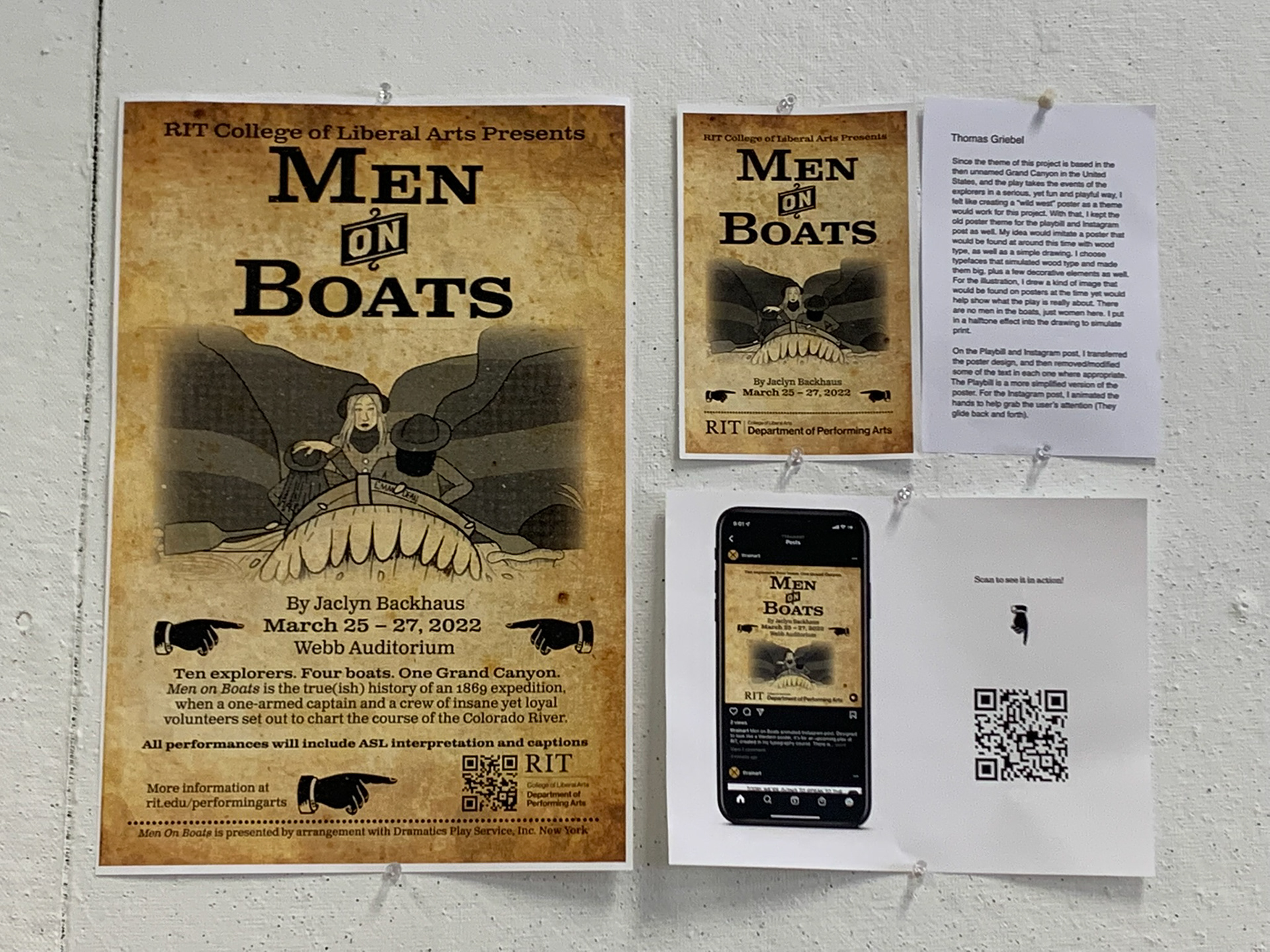
A design created for an upcoming play at RIT made in my Typography II course. The play is set during John Powell's 1869 exploration of the then unnamed Grand Canyon. With this in mind, I decided to have my design based off an old western poster. My design would then need to work on an oversized tabloid poster (12x18"), a playbill cover, and an Instagram post.
Final products
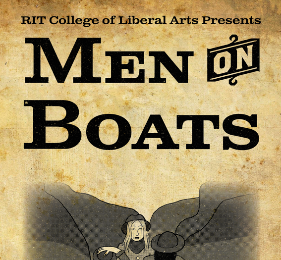
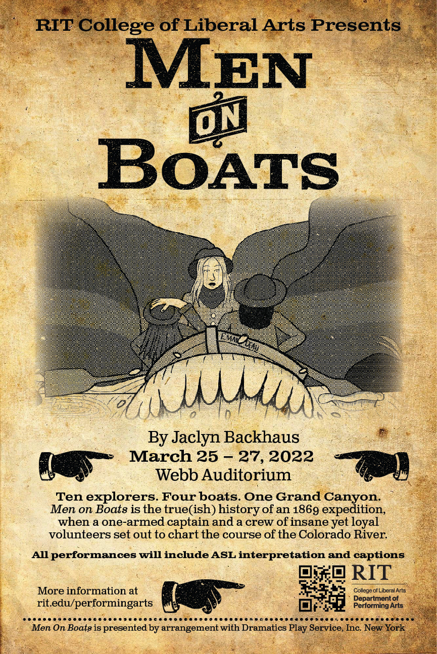
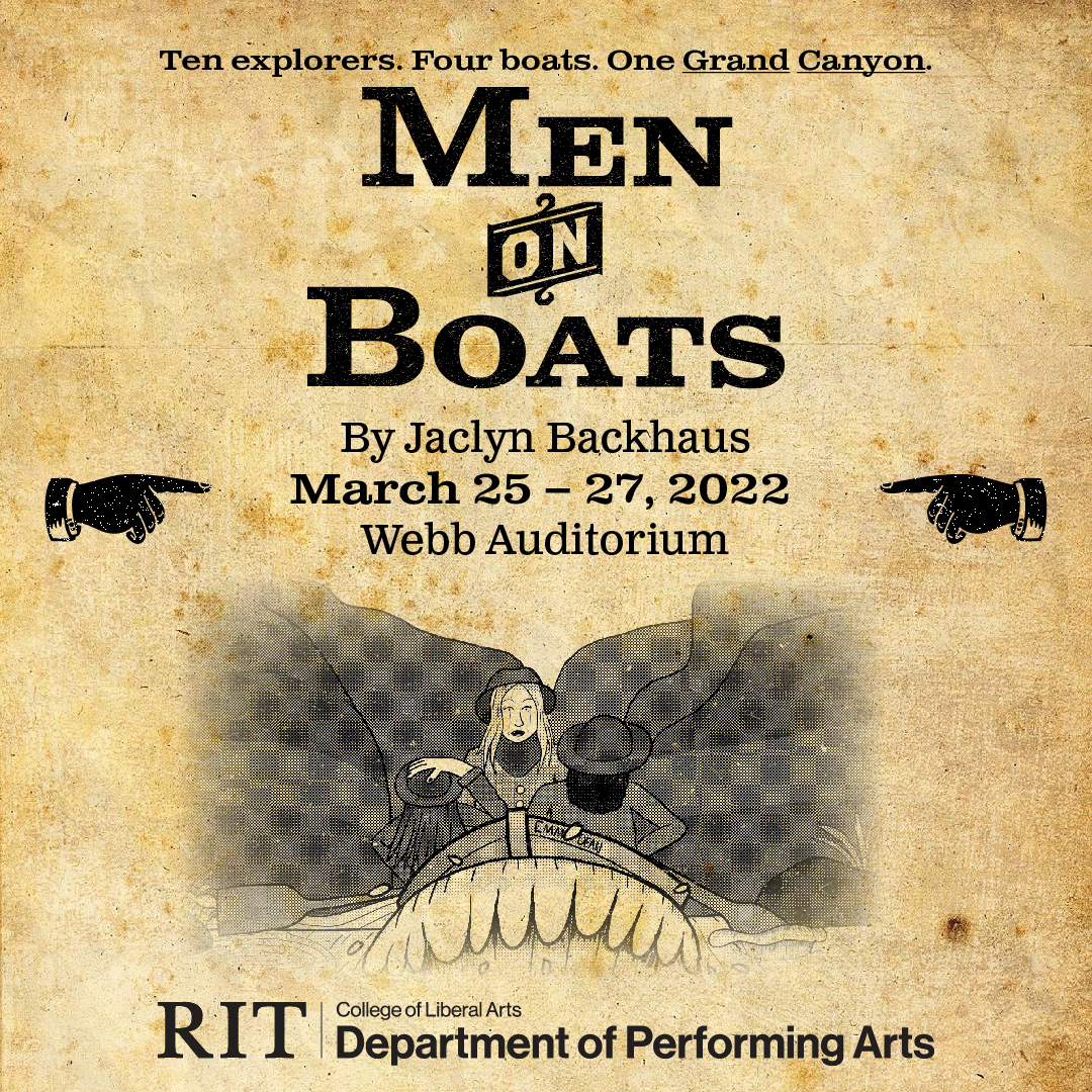
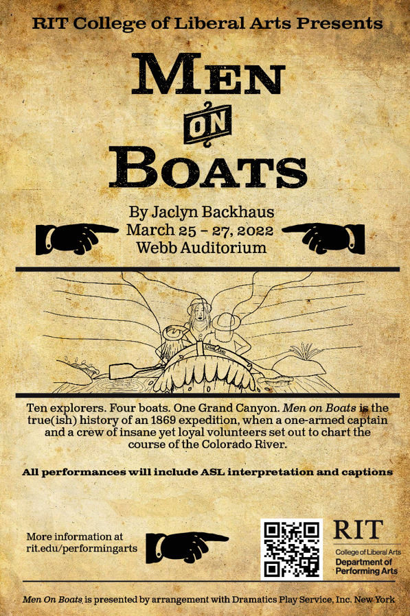
The final poster design I made. The drawing as created in Photoshop while text and layout were done in Illustrator. After this was completed, I made my playbill cover and Instagram post based off this design.
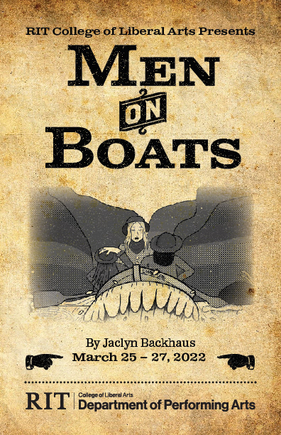
The playbill cover design I made based off the poster design. The vast majority of the text from the poster could be removed here. The size here is 5.5 x 8.5 inches.
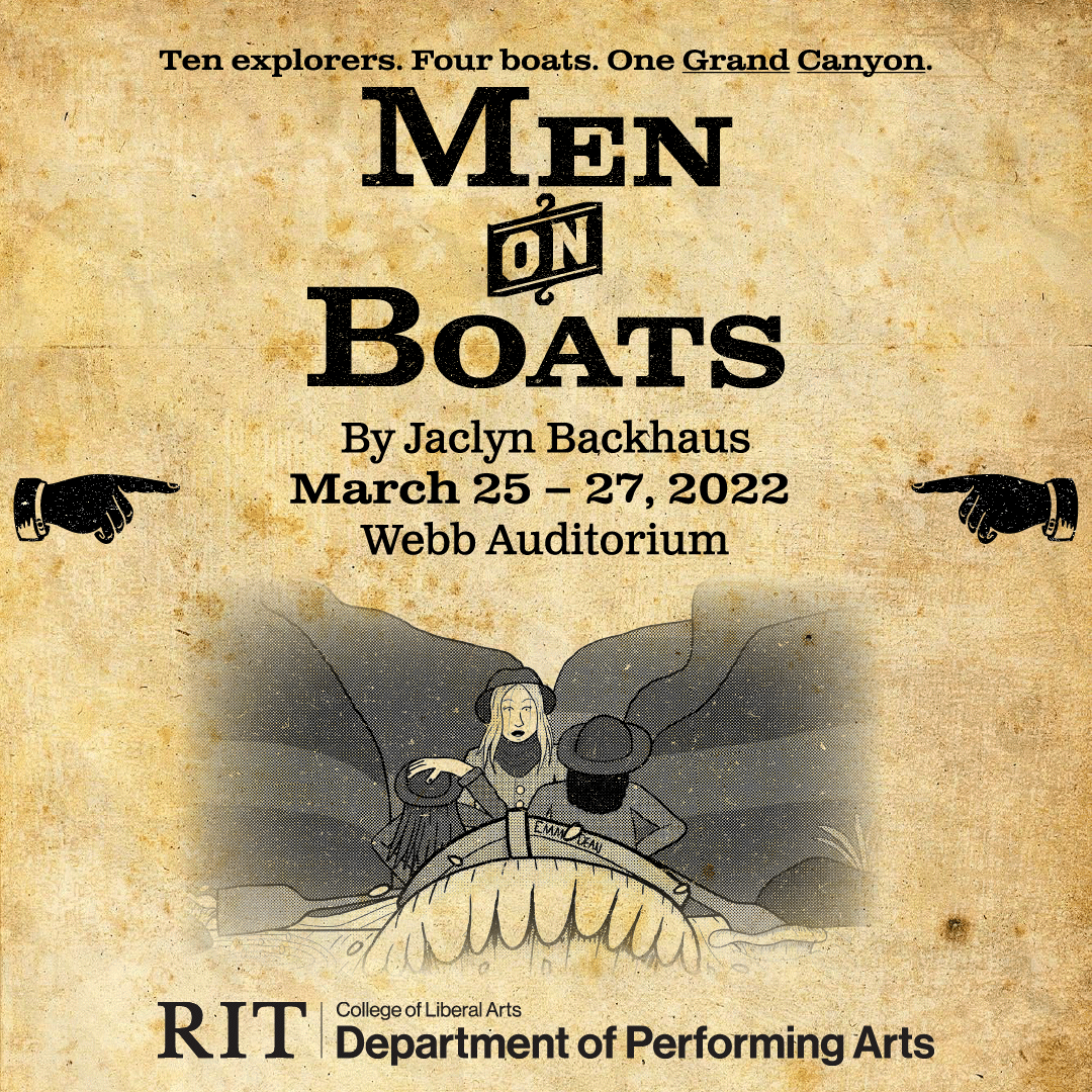
The Instagram post that I designed while keeping the overall poster feel. I kept the animation simple here, and worked hard to get all the necessary stuff to fit in an 1080 x 1080 pixel post.
Everything, including concept statement on display. The poster and playbill are the actual size of how they would appear in real life.
"Since the theme of this project is based in the then unnamed Grand Canyon in the United States, and the play takes the events of the explorers in a serious, yet fun and playful way, I felt like creating a 'wild west' poster as a theme would work for this project. With that, I kept the old poster theme for the playbill and Instagram post as well. My idea would imitate a poster that would be found around this time with wood type, as well as a simple drawing. I choose typefaces that simulated wood type and made them big, plus a few decorative elements as well. For the illustration, I drew a kind of image that would be found on posters at the time yet would help show what the play is really about. There are no men in the boats, but women here. I put in a halftone effect into the drawing to simulate print.
On the Playbill and Instagram post, I transferred the poster design and then removed/modified some of the text in each one where appropriate. The Playbill is a more simplified version of the poster. For the Instagram post, I animated the hands to help grab the user's attention (They glide back and forth)."
- Concept Statement
Other Related Stuff
Still from the animation.
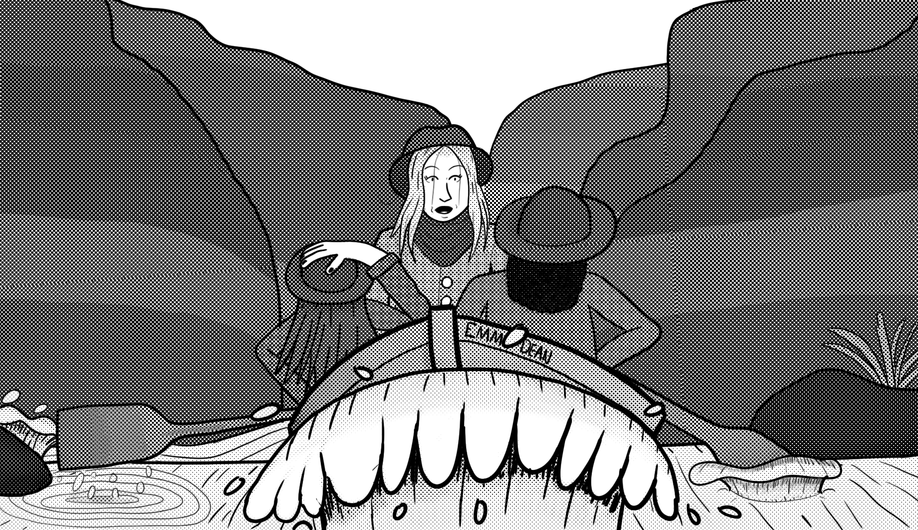
The illustration drawn for the poster. You cannot see it too well in the preview but a halftone effect was applied to give the impression of something printed.
Instagram mockup I created when the work was on display. Since this would be printed, its just a still.

Development
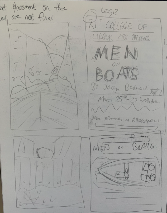
Early sketches of some poster designs I had in mind. At this stage, I was figuring out if I should do a more illustrative approach, or a more western poster approach.
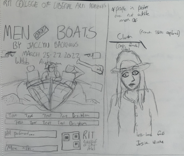
More refined sketches that would lead to the final poster design. I also included a early design of the woman that faces towards the viewer.
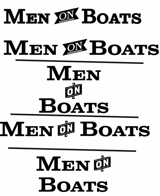
These are some type experiments I did with the title "Men on Boats." For the sake of balance, I stuck to the 2nd one (after the thick line).
This was a layout test for the poster to make sure the overall layout would work. At this point, neither the drawing, QR code, or school logo has been implemented yet.
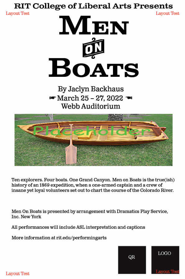
An early version of the poster that is still in progress with some slight differences in layout and size. Not only has the drawing not been filled yet, but it was also much wider. Not everything is also properly aligned here as well, and the QR doesn't have its white background removed. Also the hands used are different.
For a brief period of time, the other text layout of Men on Boats was used as my playbill cover design, but it was changed for balance and consistency.