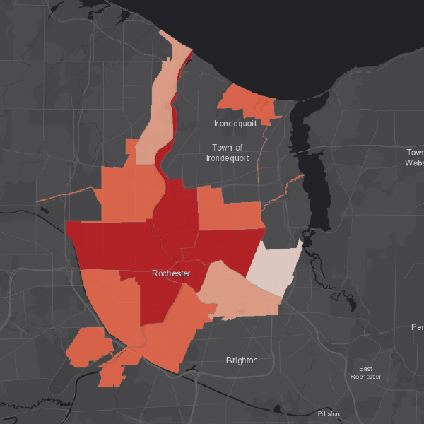
Poverty map of Rochester, NY. These areas would be my system's main focus.
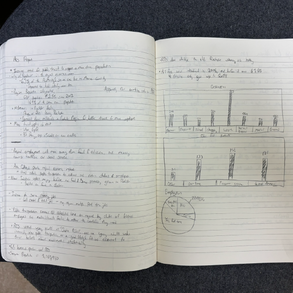
Some notes from an RTS report about ridership.
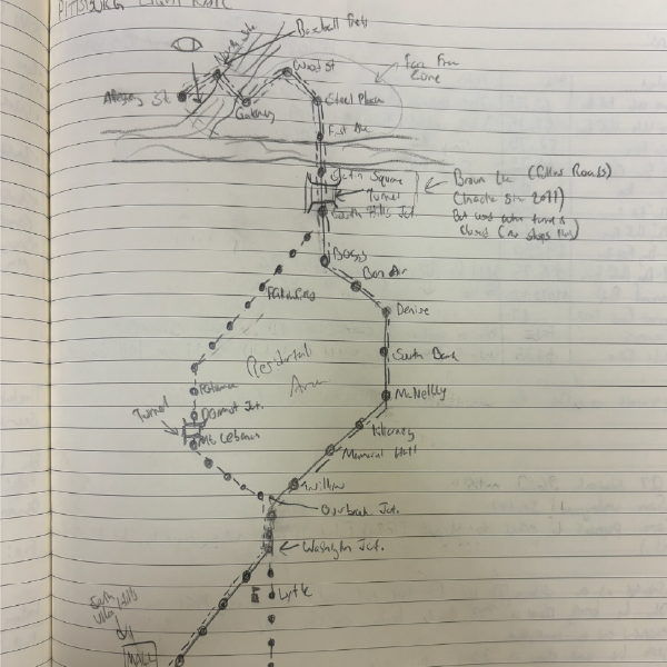
Pittsburg Rail System visualized.
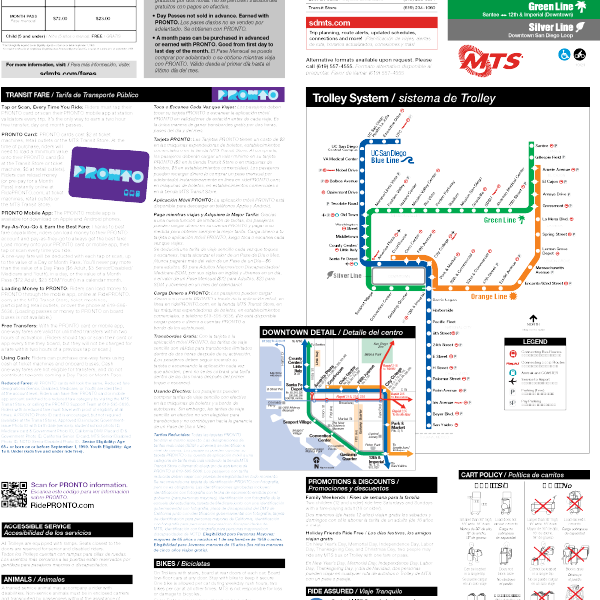
San Diego trolley system

Station under construction during my visit in November, 2023.
Overview of a station in Buffalo. The Buffalo Light Rail System is fully handicap accessible, making it a good base for this project.

Map and system information. The map does it's job, but it feels stuck in the late 90s. I wouldn't have known this was a modern poster if it wasn't for the "FACE MASK REQUIRED" message on it.
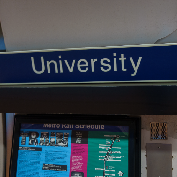
Station signage
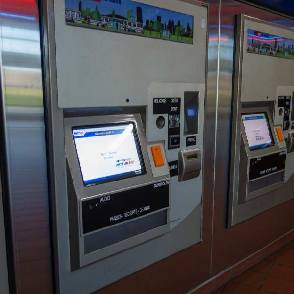
Kiosk Stations for Transit Cards.
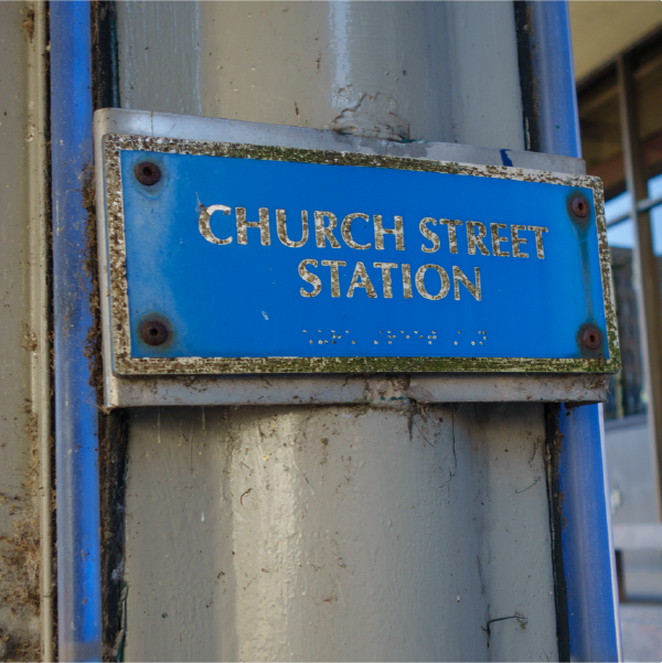
Small station signage with braille on it. However, it looks kind of worn out.

Interior of a car.
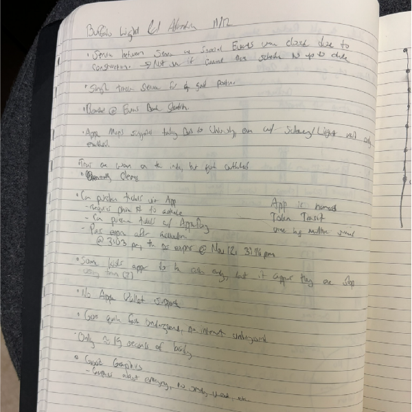
Notes I took during my adventure about the system.
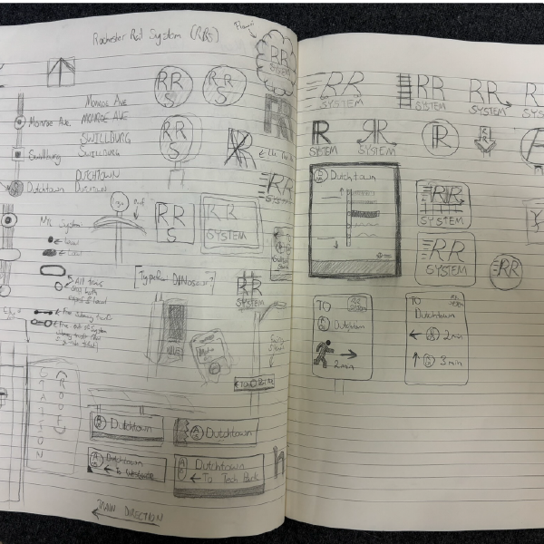
Sketches of the overall design of some branding elements
Sketches of Transit Card
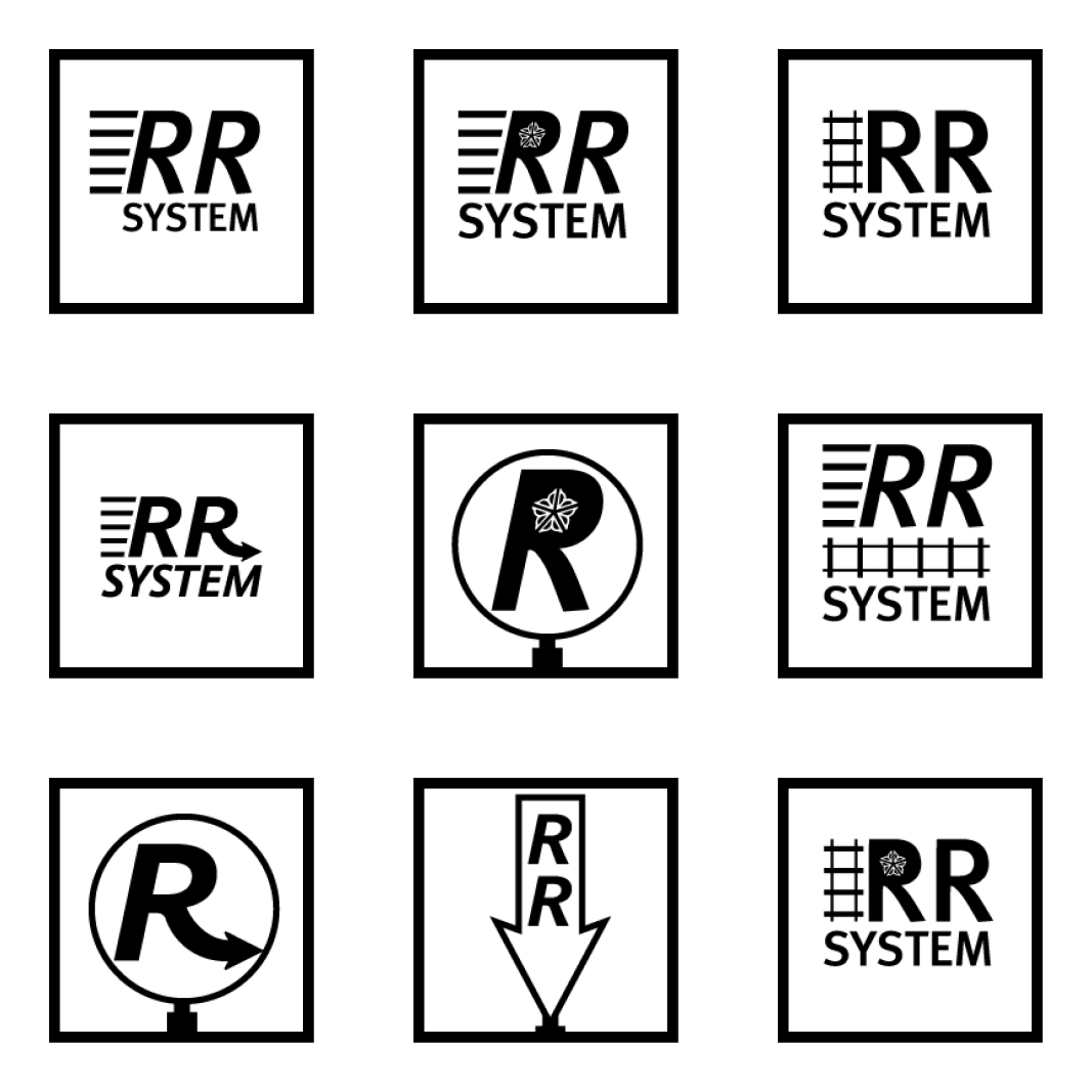
Some logo designs, including Station markings, similar to Boston's T system (this idea would later be abandoned).
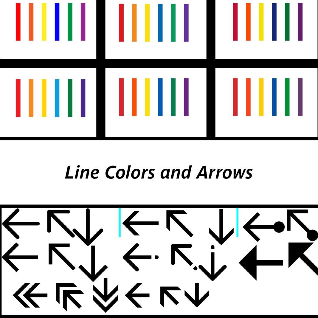
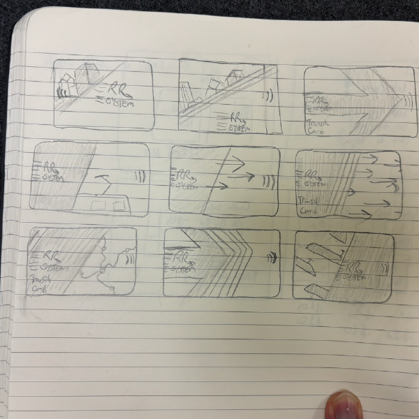
Some line and arrow ideas I tried and experimented.
Early wayfinding station signage
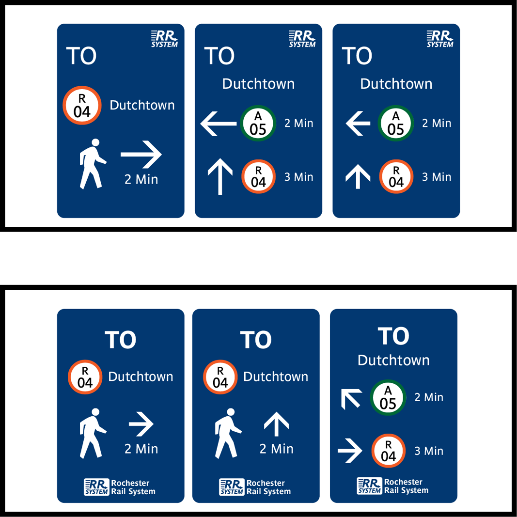
Early signage that would appear to guide people to stations
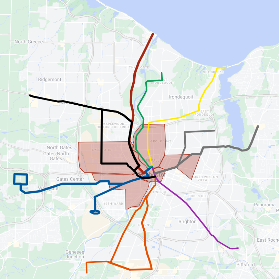
First rough idea for the map layout. The red shaded areas represents the area in Rochester with a high poverty rate.
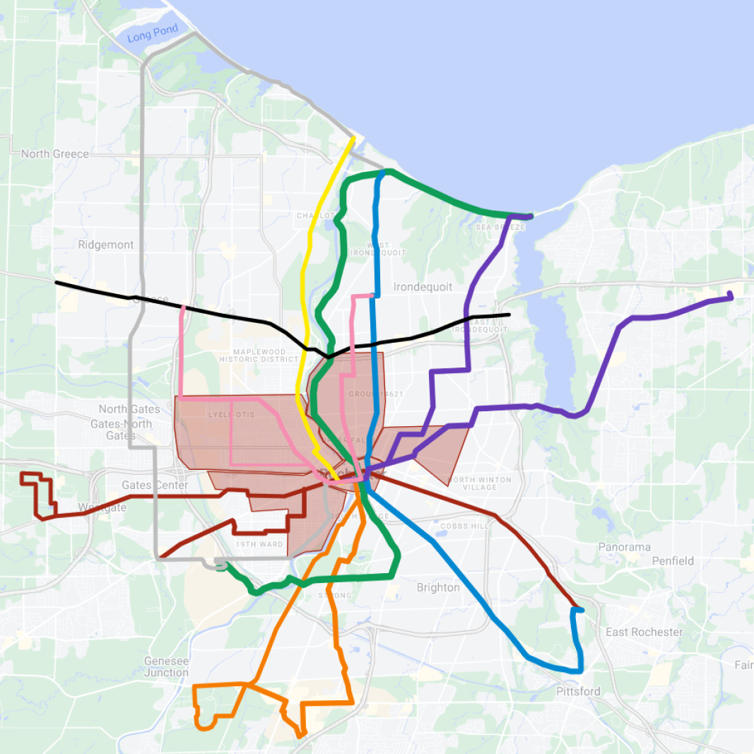
Near final map layout, with the lines more connecting while at the same time branched out, inspired by a documentary about Boston's T system.
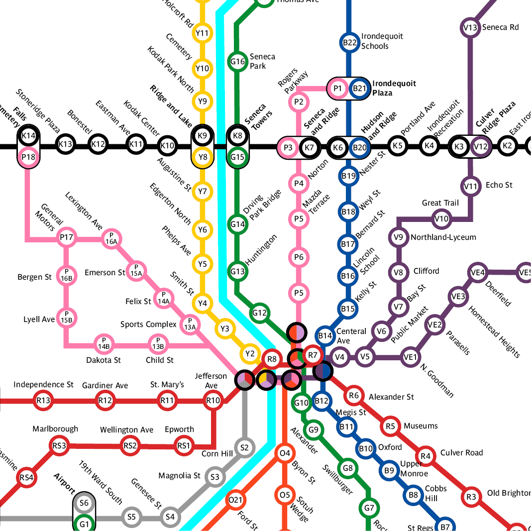
Early designed map, with all directions going vertical, horizontal, or a 45 degree angle.
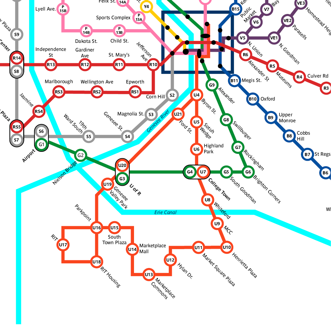
Updated map design from the previous image. In this version, the Orange Line's code was changed from "O" to "U" due to concerns it would've been mixed up with zero. I also made it so some line directions turn at an angle that's divisible by 30 degrees.

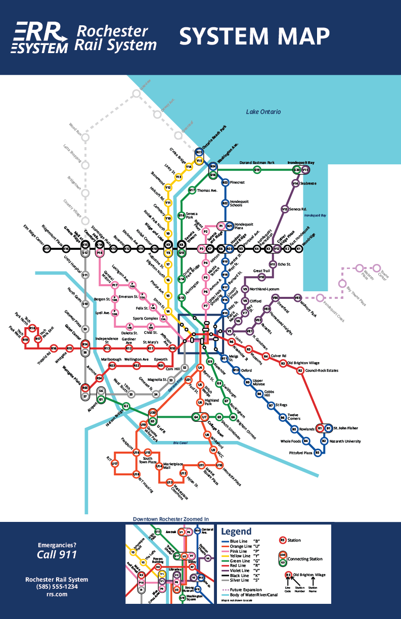
Final System Map Design
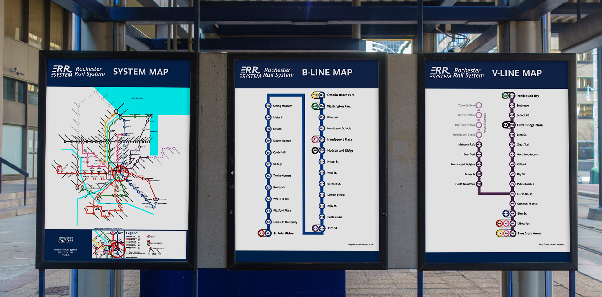
Mockup of a system map, and line map in use.
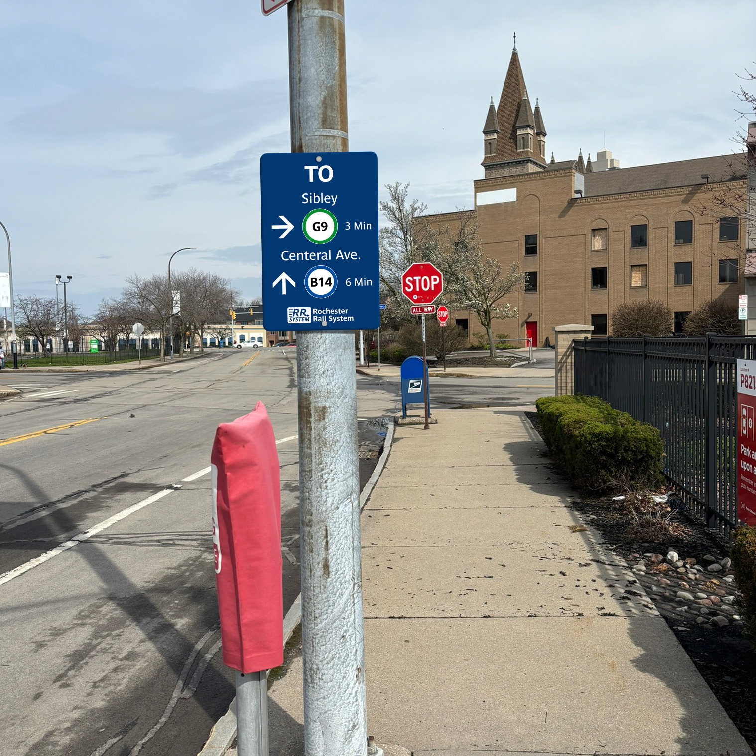
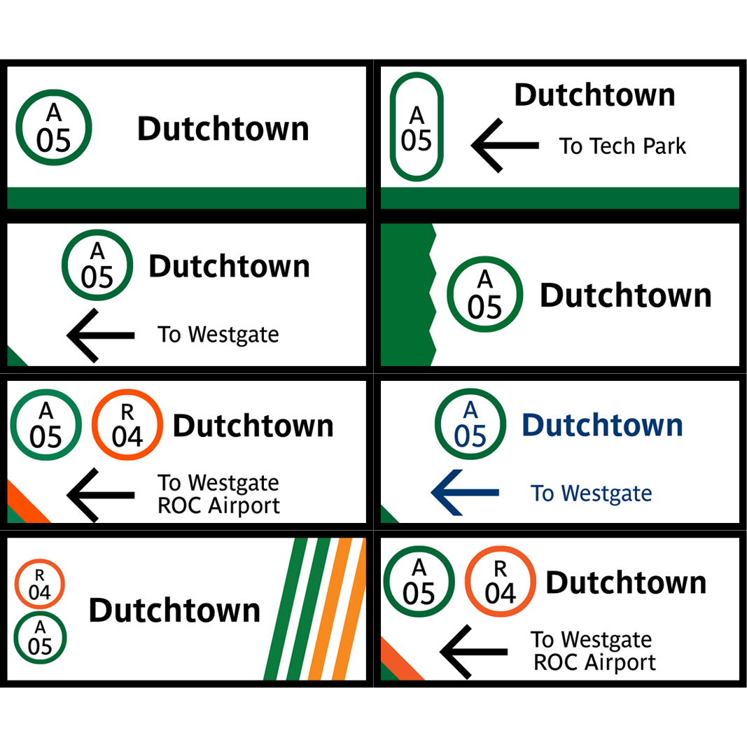
One example of a signage telling people where the nearest station is, and how far at a standard walking pace.
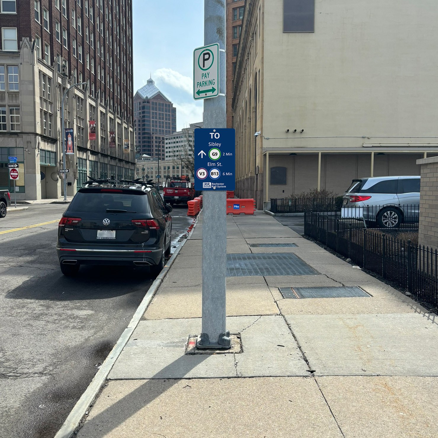
One example of a signage telling people where the nearest station is, and how far at a standard walking pace.
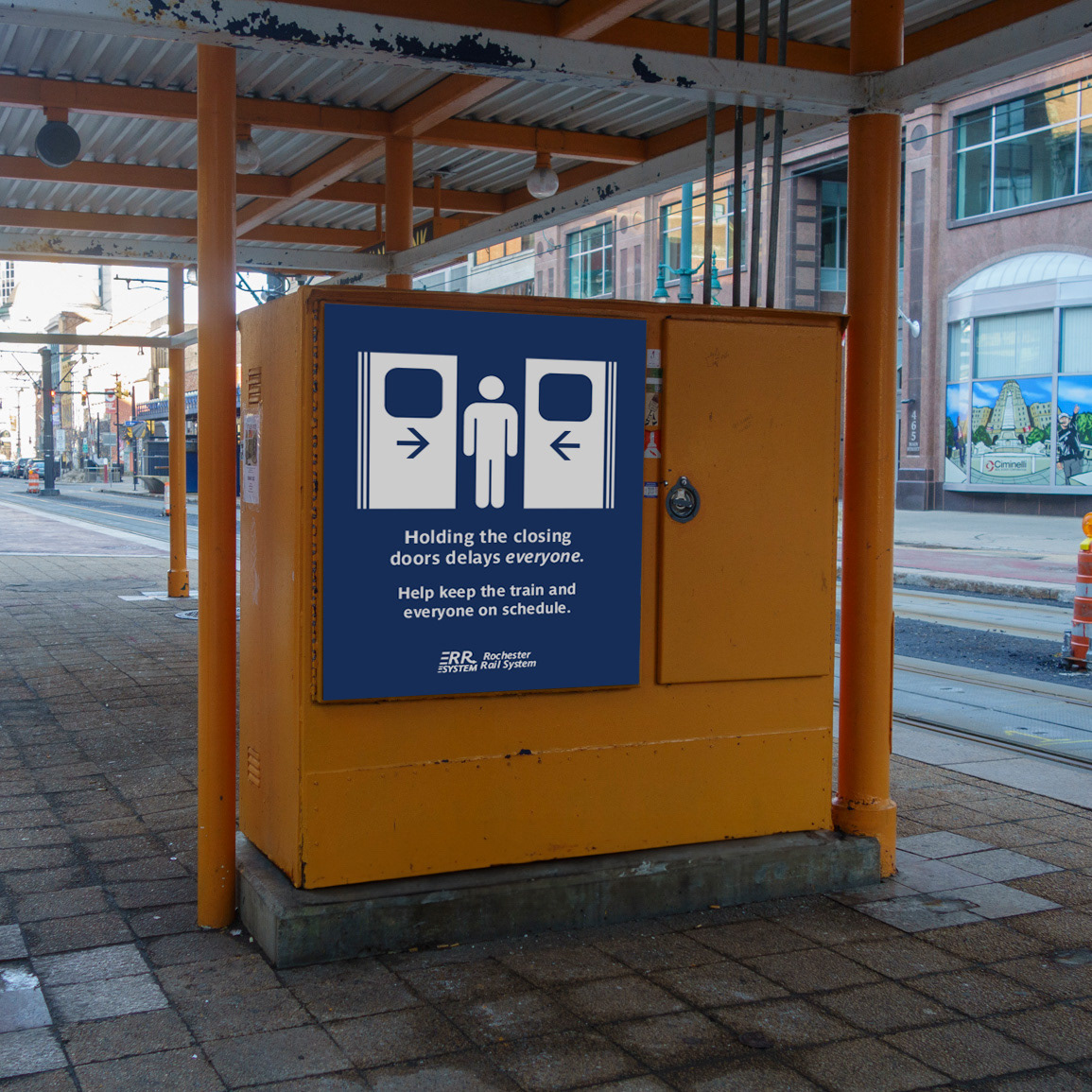
Example of a long term PSA. This can also be used for ad space.
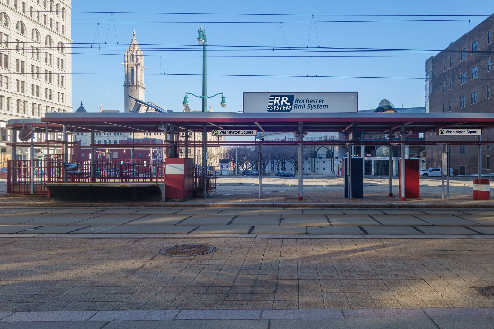
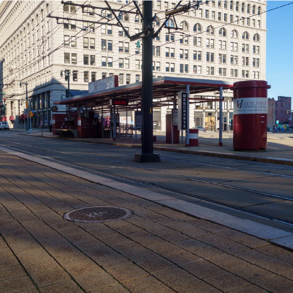
Example of a station.
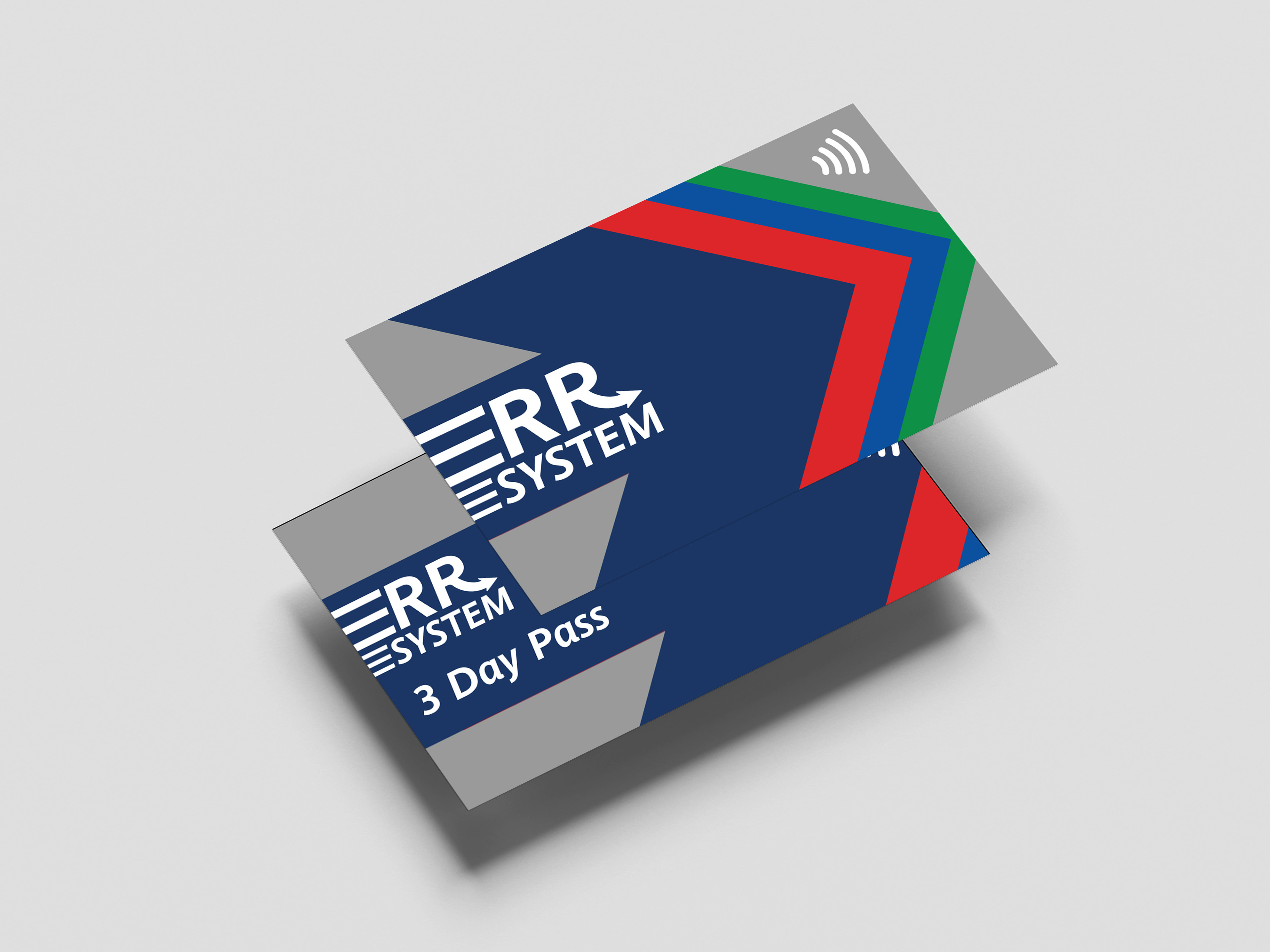
Transit Card. Instead of swiping, you tap to pay your fares, and can also support digital wallets such as Apple Wallet.
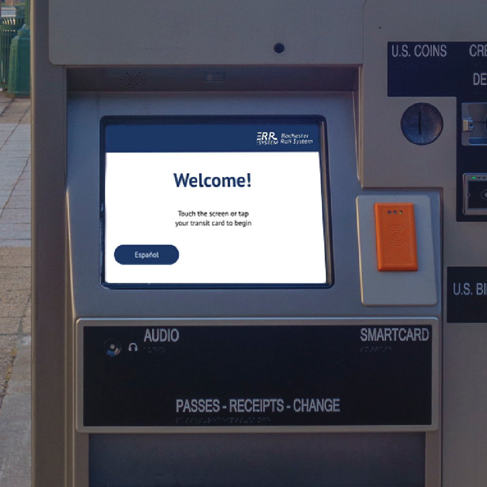
Station kiosk for new transit cards, or to refuel for fare balance.

Project on display during RIT Graphic Design 2024 Capstone exhibit.